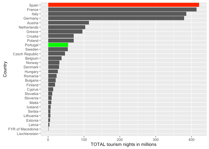
Eurostat released a short statistic about the number of tourism nights spent in the EU in 2015. Curiously, Spain shows up as the top tourist destination in Europe. Hm… right at the moment when everyone is speaking about the Spanish influence everywhere. Top. What does that really mean? And what is it about all these rankings in absolute terms that are not comparable across countries in the first place?
When looking at the data we can see that there is no “normalisation”. All comparisons are made in absolute terms. And this is like comparing apples to oranges or comparing China population to the Vatican. Doesn’t make any sense to me.
The data contains also the number of tourism nights of Non-Residents and of Residents for each country.
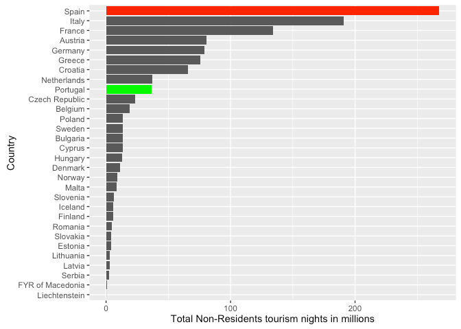
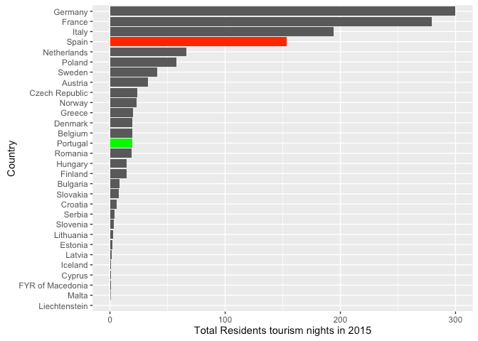
This in itself is very interesting, because we can take different strategies to compare the two different types of tourism. Non-residents visiting the country vs Residents visiting other other parts of their own country.
The issue with this type of raw data is that it gives the impression that things are very different when sometimes they aren’t. Portugal and Spain appear very different from this chart, but the it doesn’t take into consideration the sizes of both countries.
We need some normalisation of the data so we can compare the numbers between different countries. Comparing Malta and France, or Spain and Sweden doesn’t mean much if one doesn’t take into consideration other things like country population, country GDP, country area, etc… Is summary we need some variable that acts as normalisation.
I fetcheb the population and area of each of the countries in the report and normalised the data by population and area. Here are some interesting results (full results at bottom of post).
Residents tourism
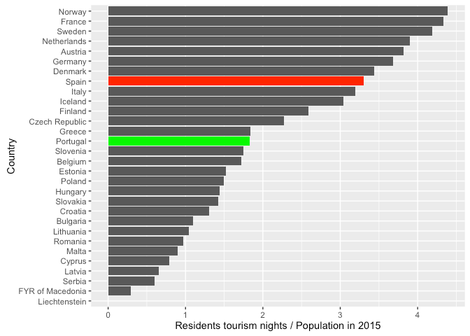
Normalising by population allows us to have a comparable measure between countries for the tourism that each country had in 2015 from its own residents. By doing so we are just getting an average number of nights each person spent doing tourism in his own country.
It is clear that Spain is not the top country anymore. Norway, France, Sweden and Netherlands take the spotlight. Their nationals are the ones that make the most tourism inside their own countries. On average a Norwegian spends almost 4,5 nights doing tourism in Norway contrary to Spain where this number drops to 3,3. Clearly rich countries residents do more tourism inside than poor countries residents — hinting that analysing this data against the GDP might be an interesting approach.
Non-Residents tourism
On the other hand if we want to see how attractive a country is to tourists, we can’t normalise to the countries population (not entirely true), but instead we can normalise in relation to the area of the country. The reasoning behind this is that the interest is proportional to landscape features — beaches, monuments, cities, etc… — that the country presents to tourists, and those are proportional to the area of the country… Obviously some locations have higher densities of tourist spots than others.
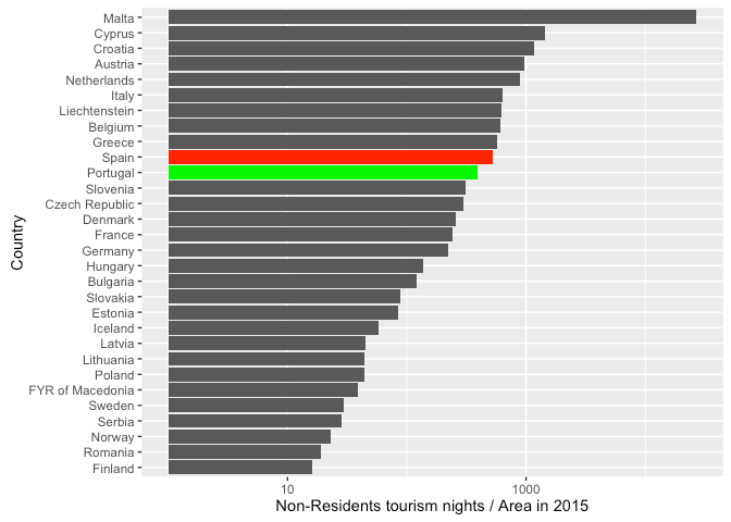
The results are surprising. Malta being a very small island is fully dedicated to tourism. It is clearly the outlier here — and forced me to use a logarithmic scale — but it shows clearly that the ranking of tourism cannot be measured by raw numbers alone. Performance and efficiency require comparable measures not raw data.
In this case Spain and Portugal are very close together. Wouldn’t that be expected? Portugal and Spain both have strong beach summer tourism, a pure geographic factor. In history terms Portugal has a common past with Spain of war and family. Therefore monuments and historic cities should be relatively similar in terms of attractiveness to tourists. Both countries have excellent food and their cultural heritage ashamed none. Why would they attract tourists in such a different way as the first chart tried to indicate?
Spain might be slightly more efficient at attracting tourists, they are closer to the European center, and there are probably some supra linear effects, but in the end iberian countries are very similar.
Conclusion
It is clear that what european agencies sometimes published should be taken with a pinch of salt. Not because their data is wrong, but because the reading of the data might be misleading.
Yes, Spain has the largest number of tourism nights in Europe. Does it mean that Spain is the most efficient country in terms of tourism? Does it mean that Spain has the largest number of touristic features to attract foreigners? Well clearly not.
Croatia seems impressive in taking advantage of what it has. Malta, Cyprus are also very effective because they are islands. If you look at nationals tourism, rich northern countries like Norway, France, Sweden and Netherlands, seem to have more nights per person than any other.
What this shows is that there are many narratives that can be written about the same data. Raw numbers alone is misleading. The difference between Portugal and Spain is not that different if you try to correct for the size of the countries.
The full analysis is available in R Markdown format and you can play with the script yourself by using RStudio.
This post is available in PDF format